An Energy Officer consulted his/her manager about the benefits of the SEMANCO tool and both agreed to pay a one off discounted fee to trial the SEMANCO tool for a period of three months to see how it could be of assistance to them. The Energy Officer working for NCC has been asked by his/her manager to use the tool to produce a report indicating areas in Newcastle with high levels of fuel poverty and energy consumption. Once the Energy Officer had provided this report, the officer was asked by his/her manager to focus on one particular neighbourhood with one of the worst levels of fuel poverty and provide some data indicating which buildings were performing worst in relation to energy efficiency. The Energy Officer uses the SAPMAP tool to assess one of the buildings which, as the SEMANCO visualisation tool illustrates, is performing very poorly in relation to energy efficiency. The Energy Officer uses the SAP tool to simulate how the overall SAP rating of the dwelling could be improved using simple low cost energy efficiency measures such as cavity wall insulation, loft insulation and a high efficiency boiler. The various steps along this process from initially reviewing which neighbourhoods contained the highest levels of fuel poverty through to assessment of particular buildings to see how they could be improved are presented below:
1. Identifying neighbourhood with high energy poverty rates.
The tool illustrates areas with high levels of fuel poverty indicated by colour shading.
1.1 Approaching to building level
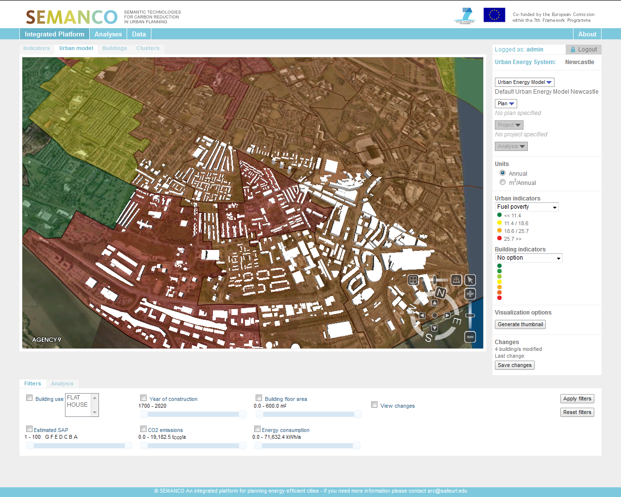
The user zooms into a particular area demonstrating high levels of fuel poverty. The Officer notices buildings begin to pop up illustrating the dynamics and footprint of an area. Due to prior local knowledge about the area in question, very quickly the Officer gains an impression as to the neighbourhoods he/she is focusing on.
1.2 Selecting buildings with poor energy performance.
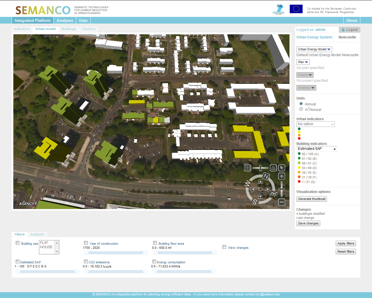
Now that the Officer is down to building level, for the second time, the indicator drop down menu is selected. This time, SAP is selected in order to illustrate SAP levels for each building in the neighbourhood. The Energy Officer can see the various SAP levels across the neighbourhood using the colour coding; green illustrating high SAP rating and red indicating low SAP. Very quickly, the Officer can identify which buildings have the lowest SAP rating and can now begin to focus on these individual buildings.
2. Introducing energy efficient improvements.
The user focuses on one specific building and gains a summary of current indicators related to it. The user can now assess this building by launching the SAP tool.
2.1 Launching the SAP tool and assessing interventions
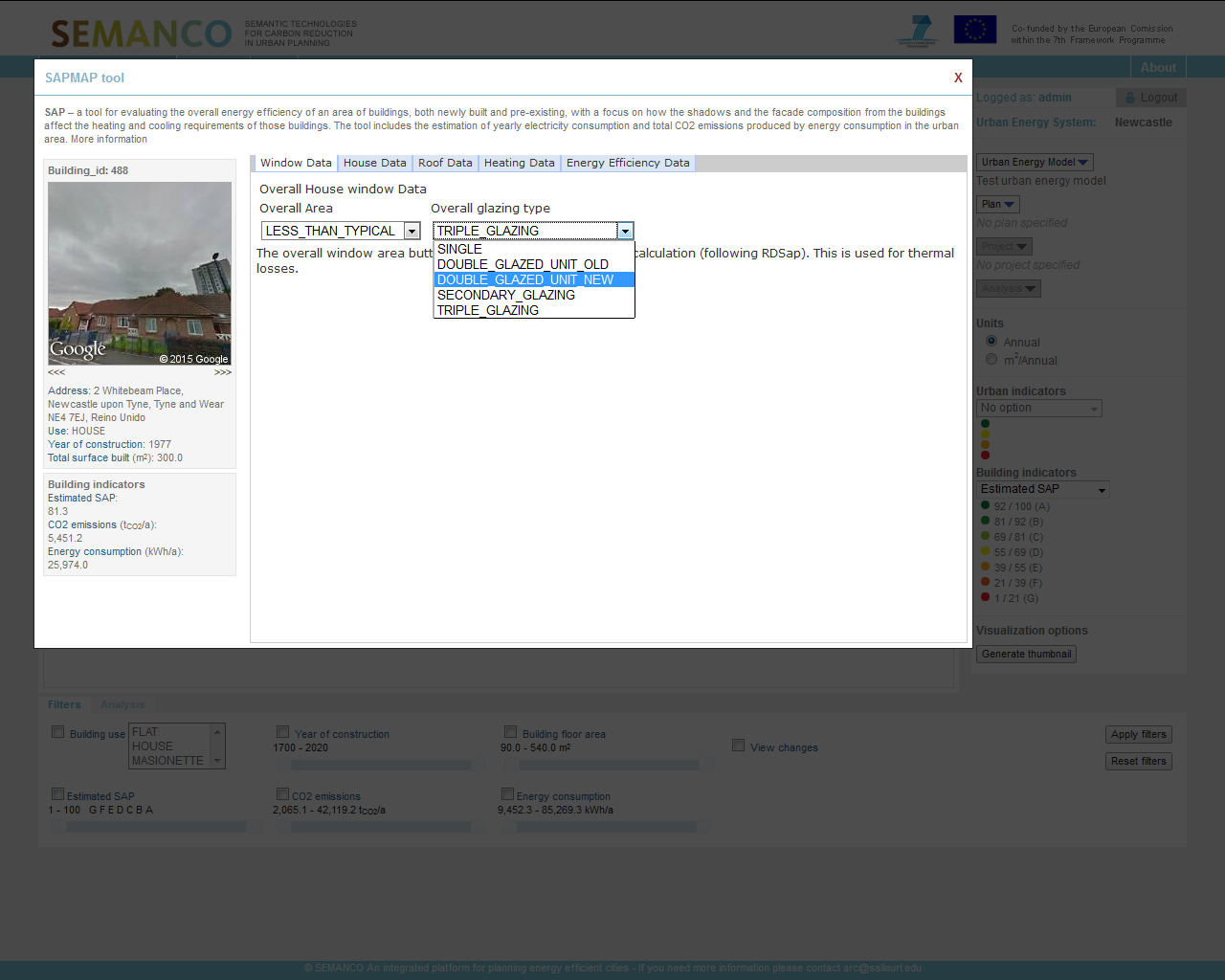
The user launches the SAP tool and begins to review and improve the energy efficiency of the building; here windows are improved. The Officer launches the SAP tool, immediately another sub window opens displaying further detail about the building in focus including House Data, Roof Data, Heating Data and Energy Efficiency Data. To the right is a photograph of the building. Very quickly the user can verify the information displayed about the building based on the photograph and begins to build up a mental picture of the types of measures needed to increase the energy efficiency of the dwelling. The Officer can see the cavity in the building has not been filled with insulation and proposes the addition of 150 mm of insulation.
2.2 Launching the SAP tool and assessing interventions
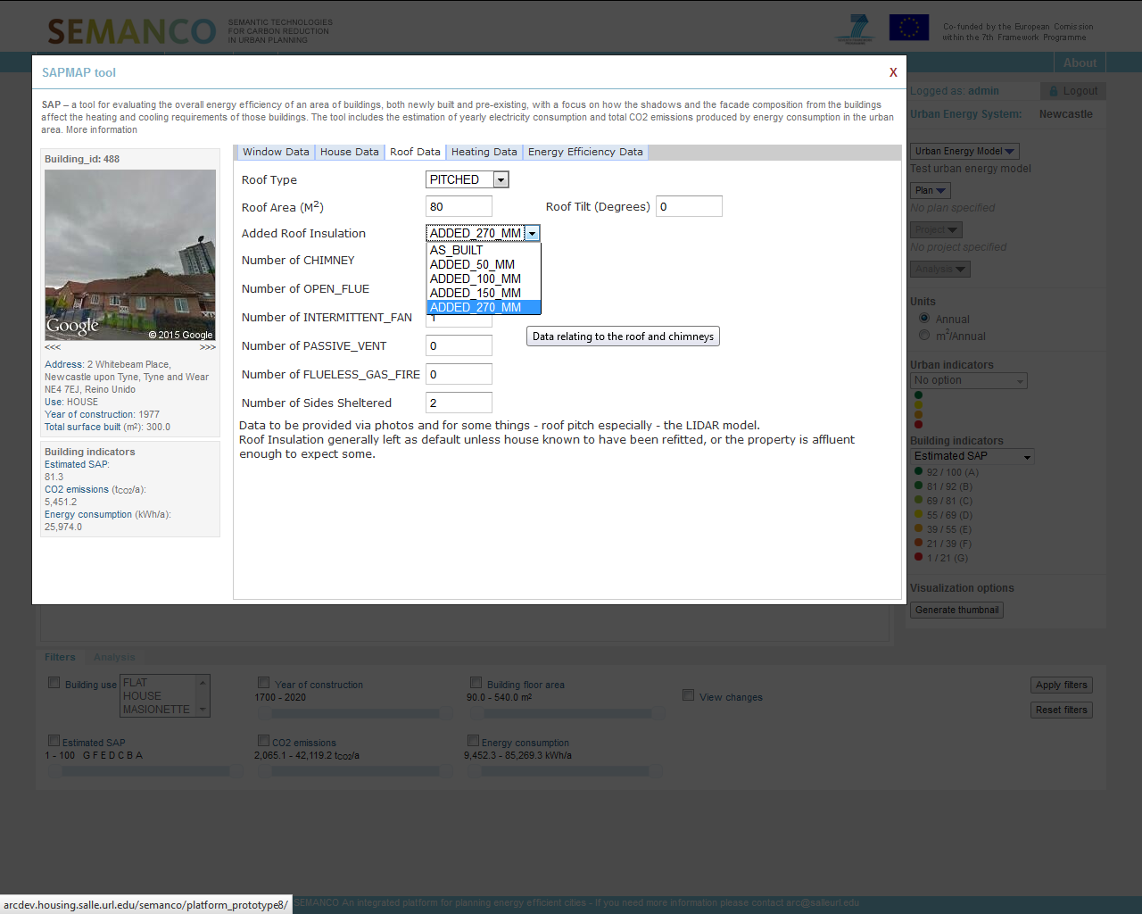
The user launches the SAP tool and begins to review and improve the energy efficiency of the building; here improvements are made to the roof. The user begins to use the SAP tool to simulate other potential energy efficiency improvements to the dwelling, in this example, the Officer can see there is limited insulation in the roof of the property and has prescribed filling the roof with 270 MM of loft insulation to increase energy efficiency hence thermal performance of the building.
2.3 Launching the SAP tool and assessing interventions
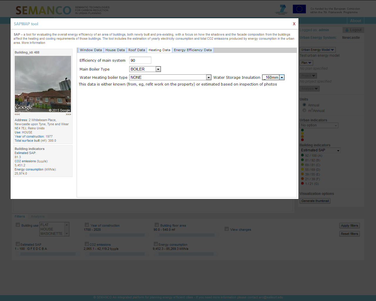
The user launches the SAP tool and begins to review and improve the energy efficiency of the building; here improvements are made to the heating system. The Officer moves along to the next tag in the SAP tool and can review the heating data aligned to the property. From this the officer can see there is an old electricity boiler running at low efficiency of just 65%. The Officer proposes changing the boiler to a gas system to provide a more efficient low cost heating solution.
2.4 Simulating energy efficient improvements
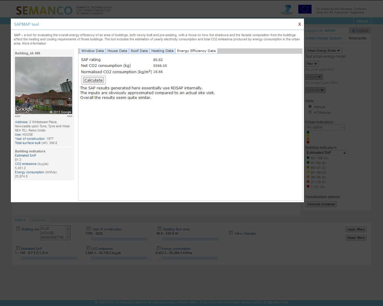
Once all the energy efficiency improvements have been made, the user can calculate the new SAP level. Based on the Energy Efficient improvements made to the property, the Officer uses the SAP calculator to calculate and simulate a revised SAP for the property. From this, the Officer can see the SAP rating has increased to 52.34 from an original SAP rating of just 35.1.
3. Complementary analysis.
The outputs of the analysis can be presented in tabular or graph form to improve understanding. Here the findings are presented in graph form.
3.1. Complementary analysis
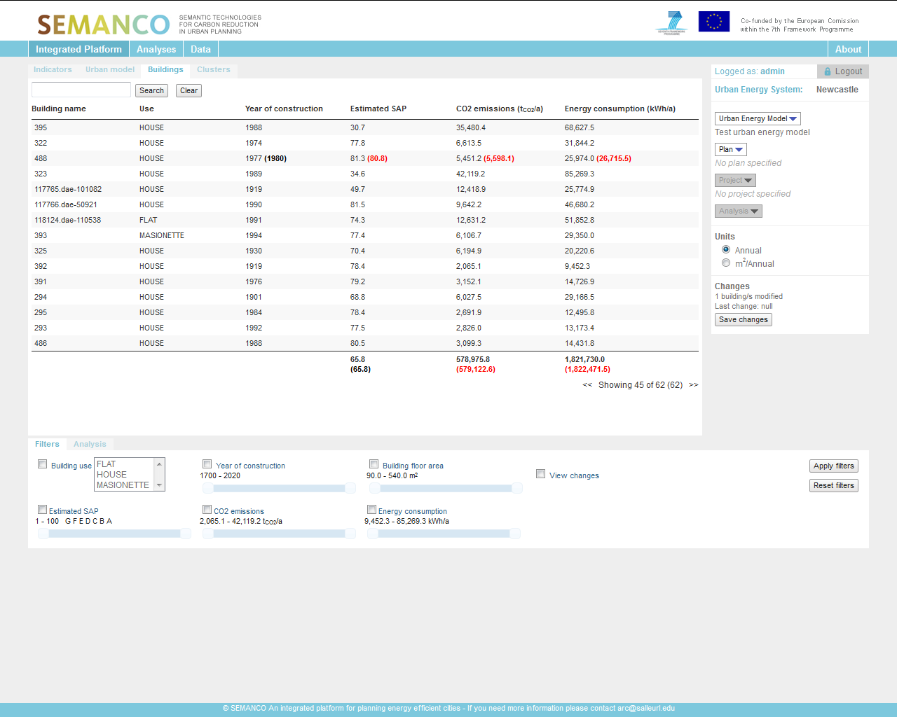
The outputs of the analysis can be presented in tabular or graph form to improve understanding. Here the findings are presented in tabular form. The Officer can also view the information displayed on the 3d map in tabular form. This provides another quick reference list illustrating building names, types, year of construction, SAP rate, CO2 emissions and energy consumption.
4. User exports the images to be inserted into a report to feedback to management.
Visual images can be used to support the case for future projects and plans for a neighbourhood